Pantone 2019 Color: Living Coral
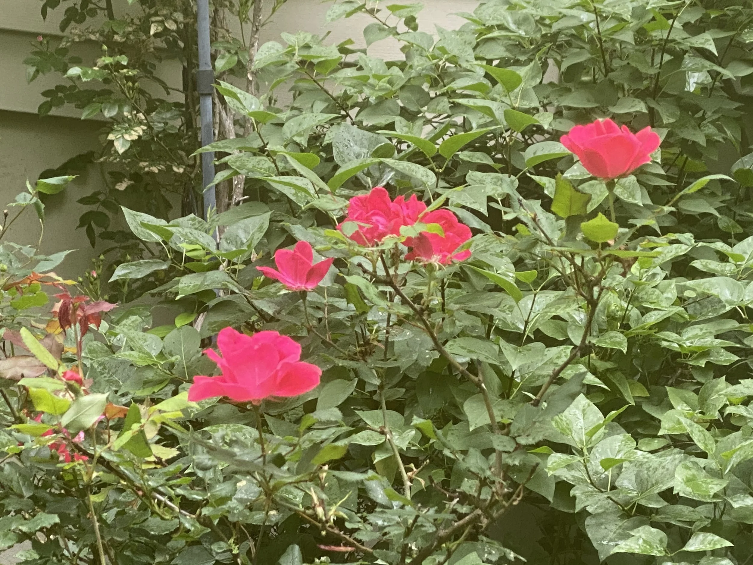
/This is the closest I will get to finding living coral in the midwest. (Photo by Charlotte Ekker Wiggins)
Pantone 2019 Color: Living Coral
Not that this makes any difference to how I decorate my ecclectic house and practical wardrobe but I do find the color of the year selections interesting. Pantone, the self-proclaimed global authority on color, has declared "Living Coral" the color of the year for 2019.
"Just as coral reefs are a source of sustenance and shelter to sea life, vibrant yet mellow, Pantone 16-1546, Living Coral embraces us with warmth and nourishment to provide comfort and buoyancy in our continually shifting environment," according to Pantone’s news release.
New Jersey-based Pantone picks a new color each year based on socioeconomic conditions, fashion trends, new technologies, as well as new trends in the realms of lifestyle, art, music, travel, and of course, social media.
This year, with technology and social media ever encroaching on our daily lives, Pantone thought it was the appropriate time to turn to nature and its beautiful colors. Not surprisingly, colors in nature have been the choice for the past few years.
If you struggle with the actual color, here is a bag that has both the pink color at the bottom and coral at the top.
For my brothers who wonder about some colors, the coral is at the top. (Photo by Charlotte Ekker Wiggins)
"Color is an equalizing lens through which we experience our natural and digital realities, and this is particularly true for Living Coral," Leatrice Eiseman, Executive Director of the Pantone Color Institute, said in a statement. "With consumers craving human interaction and social connection, the humanizing and heartening qualities displayed by the convivial Pantone Living Coral hit a responsive chord."
According to Pantone, the engaging nature of living coral "welcomes" and "encourages" lighthearted activities, and its authenticity enables connection and intimacy.
"In its glorious, yet unfortunately more elusive, display beneath the sea, this vivifying and effervescent color mesmerizes the eye and mind," Pantone said in the news release. "Lying at the center of our naturally vivid and chromatic ecosystem, Pantone Living Coral is evocative of how coral reefs provide shelter to a diverse kaleidoscope of color."
Sherwin Williams 2019 Color: Cavern Clay
This paint company’s take on the coral trend for walls. (Photo by Charlotte Ekker Wiggins)
Now a couple of decades ago when I was re-modeling my house, I asked the designer helping me with wall colors to pick a warm, inviting, a bit of a “hug” color for my bedroom. The color she picked was terracotta, which is a lighter version of the Sherwin Williams 2019 color.
Cavern Clay SW 7701A “is a nod to midcentury modern style, but with the soul of the American Southwest, which together creates a desert modern aesthetic.
“This warm, earthy hue is both casual and refined. It can be the backdrop of a playful, welcoming dining room or kitchen when paired with bright tiles, warm stone and sculptural greenery. Complementary materials include leather, simple woodgrains and indigenous cacti in contemporary, sleek gardening planters.
Cavern Clay is an easy way to bring the warmth of the outdoors in. Envision beaches, canyons and deserts, and sun-washed late summer afternoons—all of this embodied in one color.” It’s not a coral color but it sure is close.
We have one handmade quilt that has a coral tone to it, Embroidered Sunbonnet Baskets. If you like to stay on trend with color, this is a quick surefire way to update your bedroom in style!
Charlotte


