Scentfull Small Vases
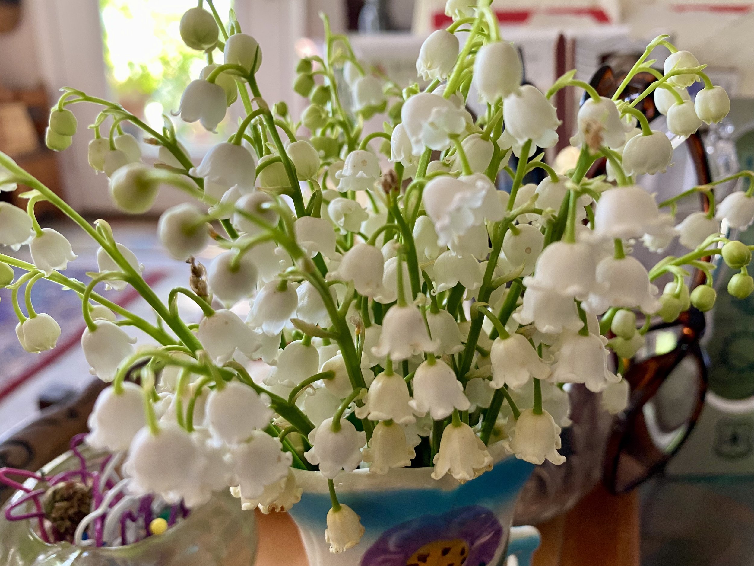
/Lilies of the Valley in a tiny vase in my kitchen. (Charlotte Ekker Wiggins photo)
Scentfull Small Vases
We all focus on tall flower vases but this is a good time to get a start on a tiny vase collection if you don’t have one.
Lilies of the Valley are fragrant and need small containers to show off their delicate beauty. It doesn’t take many of them to fill a room with their lovely scent.
My favorite way to include them in my home is through small vases in bathrooms. I also keep a vase close to where I work on the computer.
Small vases can be hard to find so be creative.
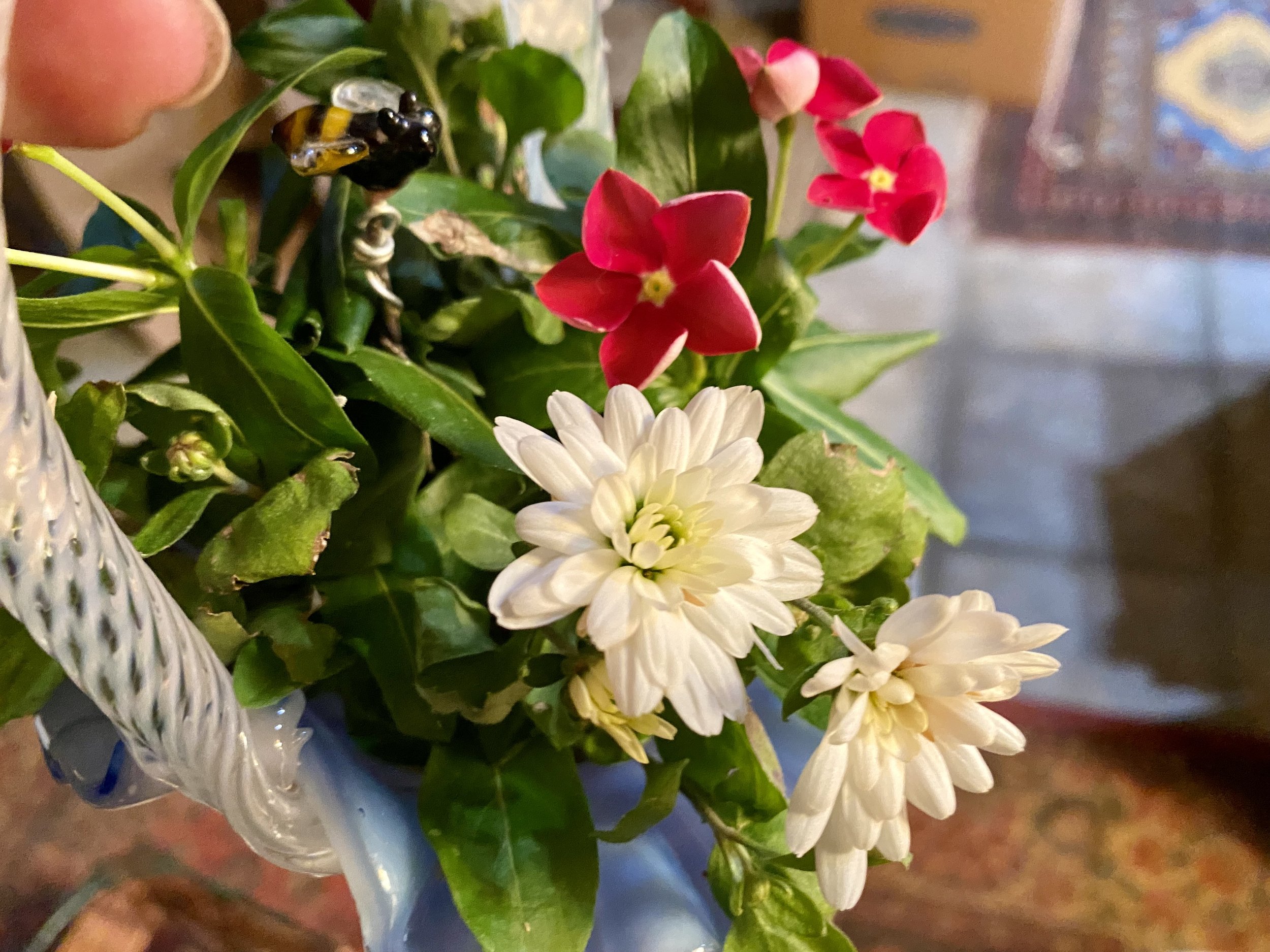
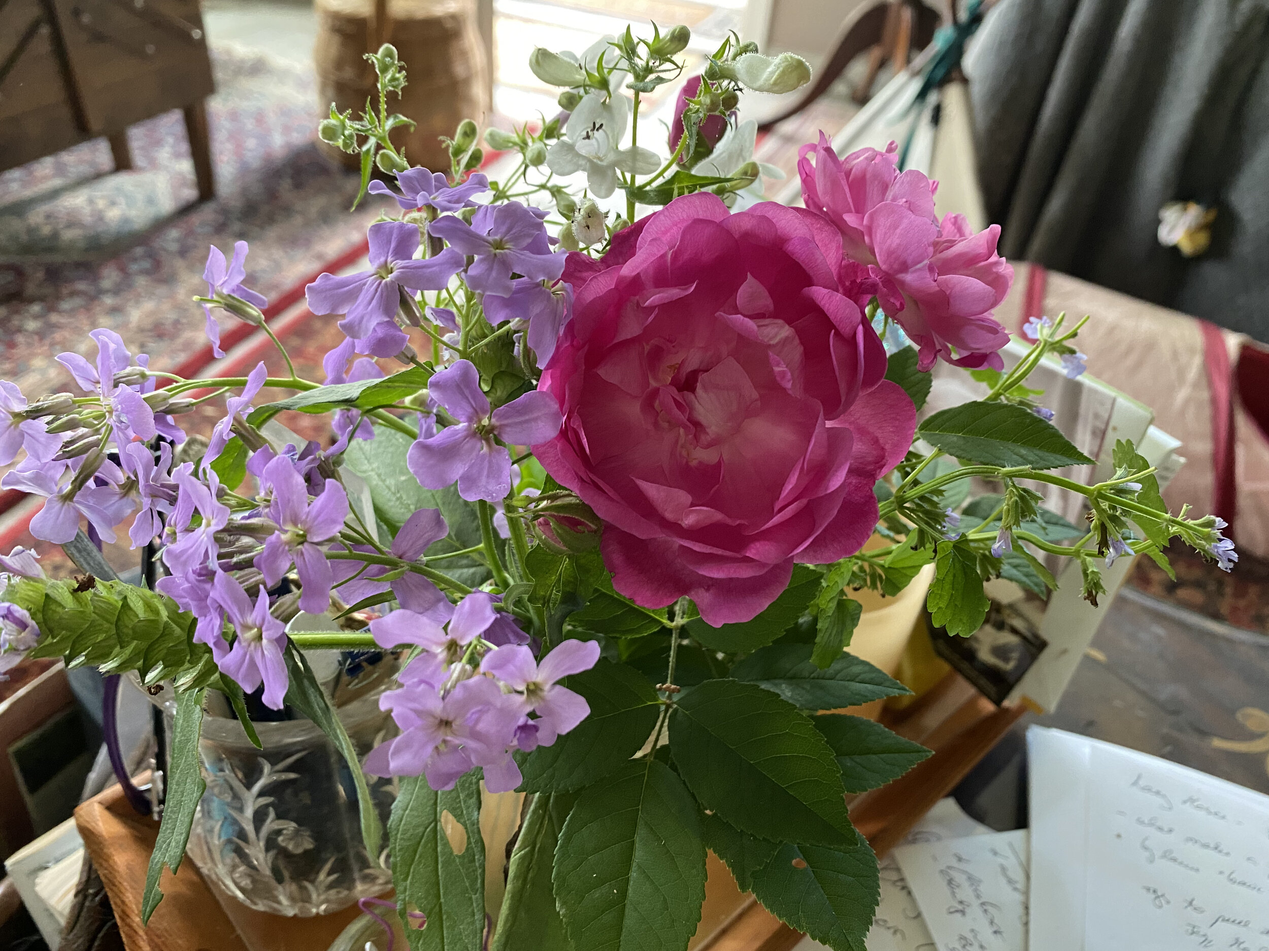
Small vases include toothpick holders and painted containers. (Charlotte Ekker Wiggins photo)
Glass and crystal toothpick holders are a good small vase size. Vintage hand-painted glass containers work well as do cream pitchers. Be creative and collect what you like.
If you’re giving them away as gifts, pick something that represents the recipient. If in doubt, keep it simple.
You will find some small vase options at local yard sales, thrift stores and antique malls.
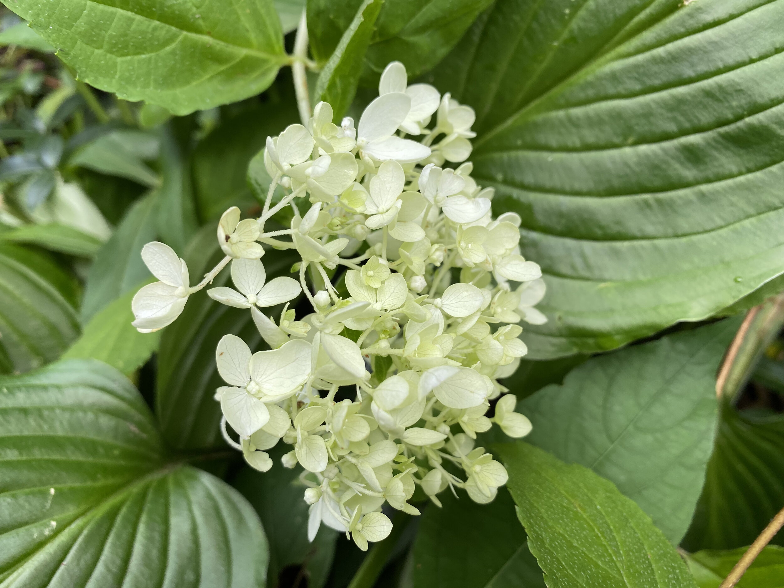
My latest small vase of Lilies of the Valley. Can you smell them? (Charlotte Ekker Wiggins photo)


